Finally, it’s here: PMax now shows where your budgets are going

Performance Max is one of the most powerful tools in Google Ads, but for years it was criticized as a “black box”: advertisers couldn’t see exactly where the system was spending their money. This made control difficult and reduced trust in the campaigns. They worked and delivered results, but nobody fully understood how Google was allocating the budget. This lack of transparency made optimization harder and often caused skepticism.
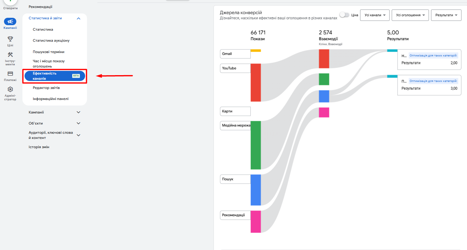
Recently, the situation has changed. A new feature has appeared in Google Ads — the “Channel Effectiveness” report. It is being gradually rolled out to accounts and allows you to see the real picture: which channels receive budget, what conversions they generate, and how effective each placement is. This is the first step toward true transparency in Performance Max, something we’ve been waiting for for years.
The report comes in two formats: graphical and tabular.
In the graphical format, you get a clear visualization — you can instantly see which channels “consume” most of the budget, which deliver conversions, and which underperform. It’s a convenient tool for quick analysis, helping you immediately understand where to focus attention.
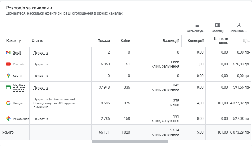
For example, in our case, a large portion of traffic came from YouTube and the Display Network: many impressions and clicks, but no conversions. Meanwhile, Search generated nearly all the leads. After we excluded the underperforming channels, the budget was reallocated to Search, which reduced the cost per conversion and increased the CR.

The second format is a classic table. It contains all key metrics: impressions, clicks, interactions, conversions, their cost, and CPA. The table allows you to dive into details and make decisions not only based on general trends but also on exact figures. For instance, you can see that Search delivered the highest number of conversions at an acceptable CPA, while YouTube consumed a similar budget but performed much worse. This signals a need to optimize creatives or rethink the channel strategy.

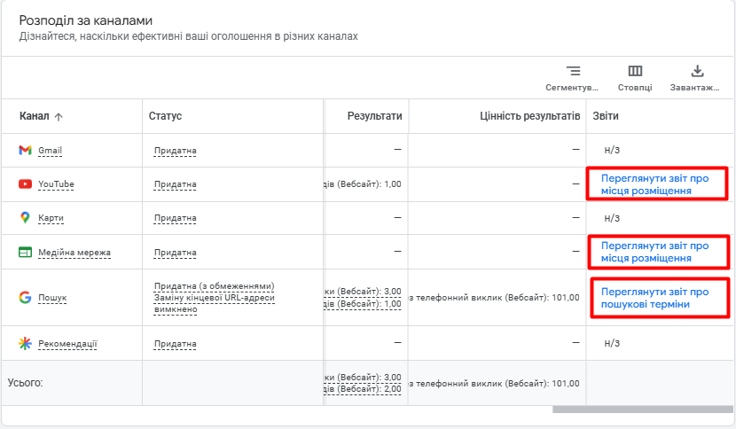
Another strength of this report is that you no longer need to create separate custom reports. Data on Display placements or YouTube videos is available instantly, in just a few clicks. If you notice that part of your budget is going to irrelevant placements, you can now exclude them directly from the interface.

In effect, we now have the transparent control that PMax had been lacking. The combination of graphical and tabular formats gives a complete picture: from quick visual insights to in-depth numerical analysis.
This means advertisers can now make decisions faster and with more confidence, based on actual data rather than assumptions. Google is gradually revealing more and more information — search terms, placements, demographics, devices. The “Channel Effectiveness” report is another step toward transparency and a long-awaited tool that helps allocate budgets much more wisely.
Its key advantages are clear:
- transparency — you see exactly where the budget is going and which channels are consuming it;
- control — the ability to quickly exclude underperforming placements or adjust strategy directly in the interface;
- optimization — by combining visualization with detailed figures, you can make decisions faster and more effectively, achieving maximum return from every dollar spent.
Not everyone can see the update yet, but it’s only a matter of time — soon it will be available to all.
Similar articles
All articles


